About this app
National Bookstore is a local bookstore in the Philippines where you can purchase top-selling books and budget-friendly school and office supplies. On their website, I decided to redesign it because it has overwhelming content and crowded graphics throughout the page. The plan is to emphasize important details and create a seamless user experience as users browse each page.
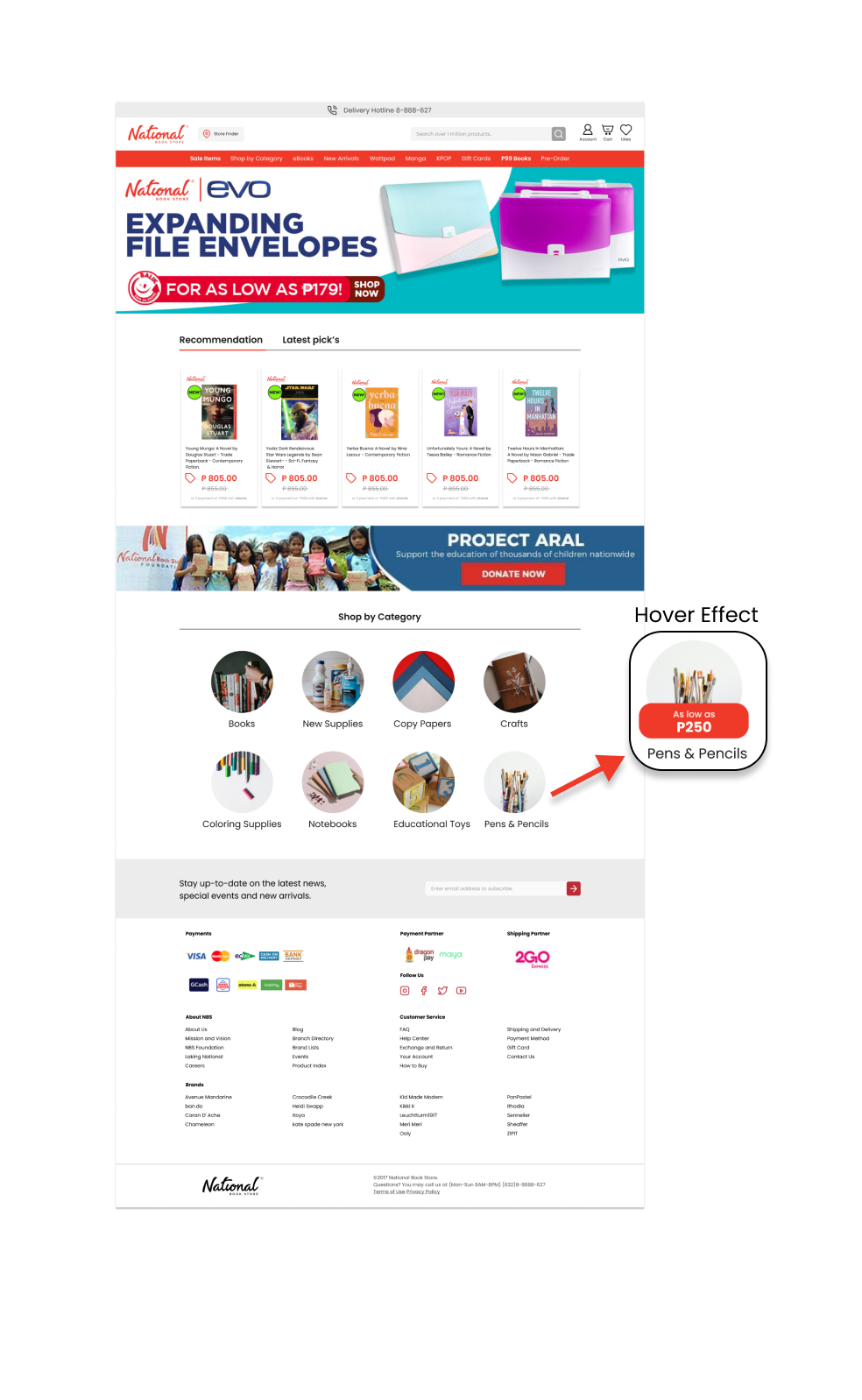
Original homepage

1. Header section are not maximized well resulting to having big gaps on the side. Icons on the right size doesn't have consistency in terms of strokes and quality.
2. I don’t feel like the execution of the title “Recommendation” is the right way. This designs are usually for multiple tabs.
3. This is too bright and out of place for the positioning of content and relationship to it’s surroundings.
Original product page
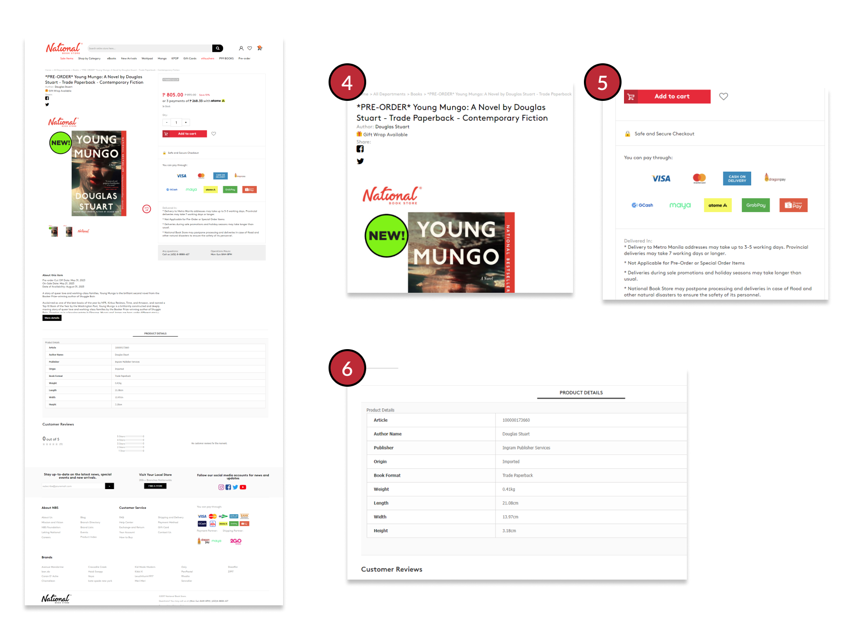
4. Title of the product has too much information and it gets busy and it tends to overlap each other.
5. Payment options are too many and it’s not relevant on the current part of the page.
6. Product details and other information below the product are not organized as what it should be and it gets cluttered.
Proposed product page design
I rearranged and added some colors on the header section to apply the branding and for the personality to pop up more.
Extended the width to maximize and highlight the featured promos.I also made the product thumbnail more bigger so it’s visible all at once.
Minimized the category section so the sections will not be busy and when hovered, the promo will slide up
Rearranged the footer for more eye pleasing layout.
Proposed homepage design
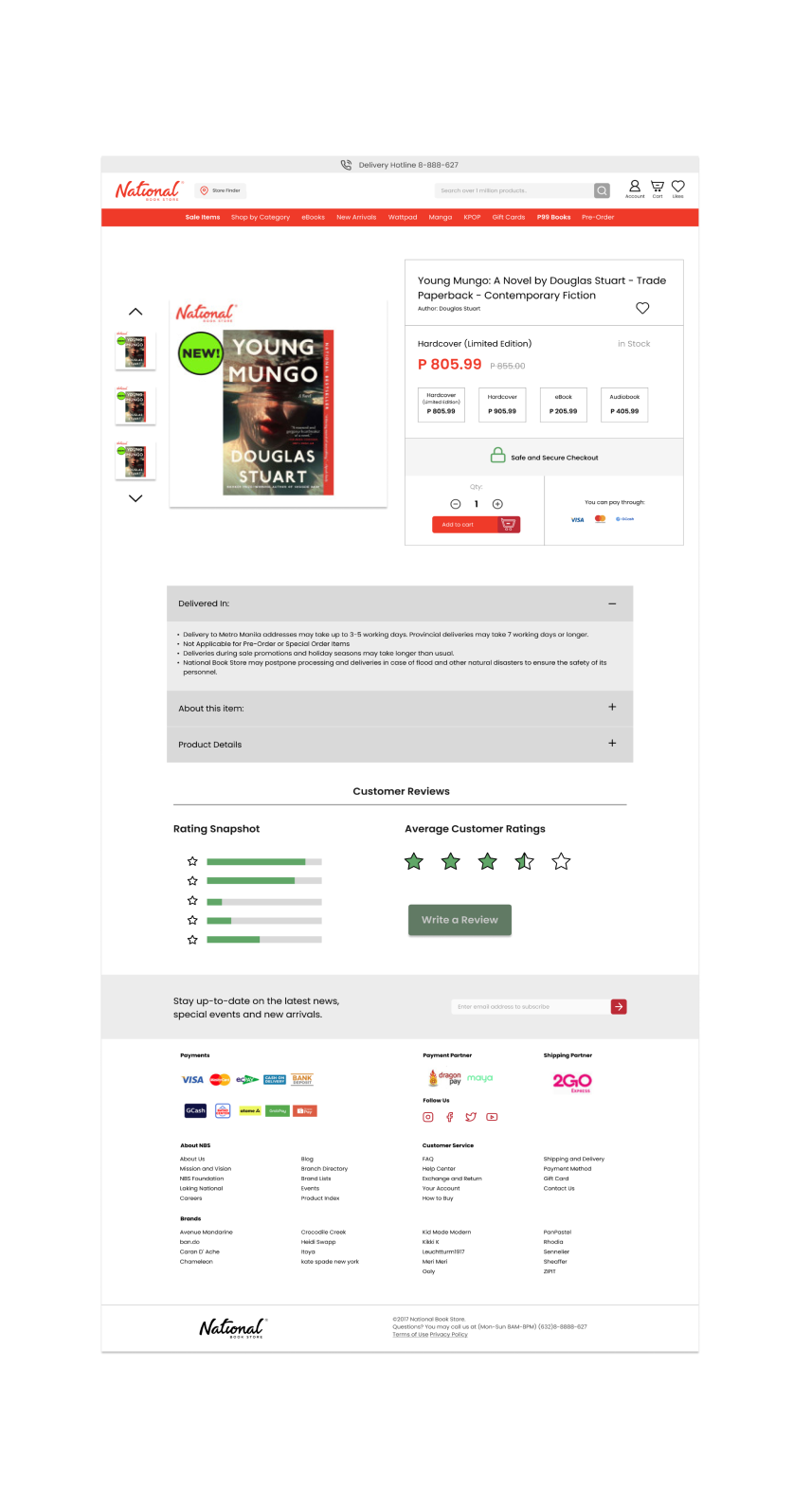
Transferred all the title and other information on the side par of the page so they’re all grouped together.
Placed the quantity and add to cart together for straightforward process.
I decided to make product details and other information placed in an accordion way so the user doesn’t bombarded with information right away but they have the option which one to open.